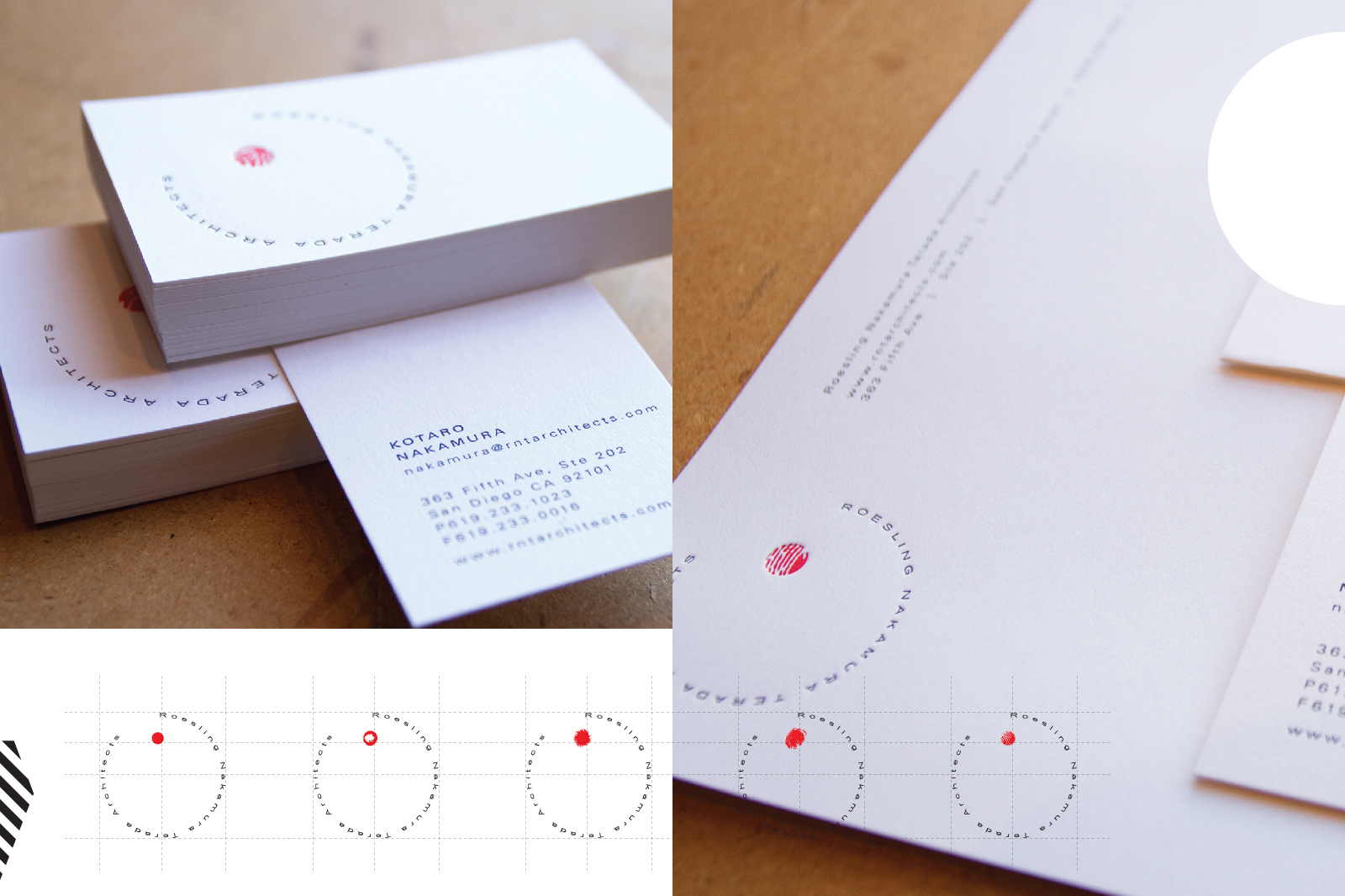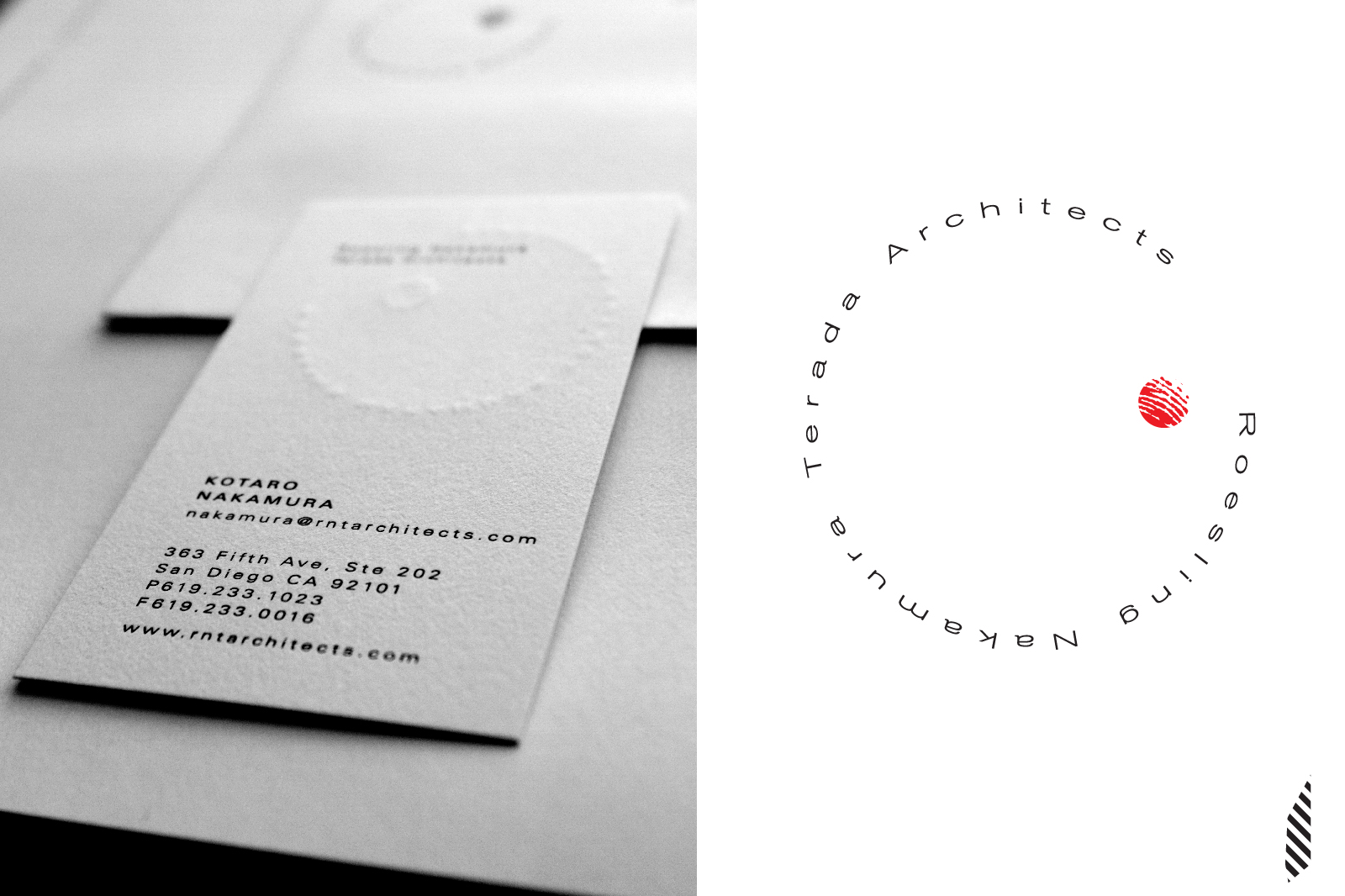

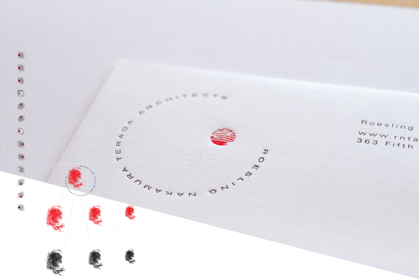
The brand update came from a continuation of their philosophy; the placement of a person in an architectural form. Each RNTA employee had a small area of one of their fingers, finger printed, vectorized, masked in a circle & placed as part of the logo on their business cards, making thirty-sum unique logos. We ended by letterpressing the stationery.
direction – bennett peji
design – nick inzunza